Anthony Dillon
on 20 August 2020
The web team here at Canonical run two-week iterations. Here are some of the highlights of our completed work from this iteration.
Meet the team

My name is Kit and I live at the bottom of the earth in Dunedin, New Zealand where I manage the MAAS frontend, engineering team. Currently, we’re working on new features for MAAS 2.9 including cloud-init support, release notifications and an improved KVM experience with better support for NUMA and SR-IOV. In addition to new features, we’re in the process of migrating the MAAS UI from AngularJS to React+Redux+TypeScript.
In my free time, I enjoy songwriting, reading contemporary fiction, baking and minding my menagerie of mad beasts.
Web squad
Our Web Squad develops and maintains most of Canonical’s promotional sites like ubuntu.com, canonical.com and more.
New Ubuntu Advantage subscription flow
We are currently working on an integrated subscription builder on ubuntu.com to replace shop.ubuntu.com. This UA subscription builder will have a cart feature and payment and management all available from within the ubuntu.com/advantage UI.
Add promotions to the download flow
To improve the awareness of the other Canonical products we have added a number of promotions which will be shown before downloading Ubuntu.
Webinars this week
Optimised authentication methods for Ubuntu Desktop

Get the ‘Authentication methods’ whitepaper
Production AI from data lake to server

Watch the ‘Production AI from data lake to server’ webinar
New security Oval page

The security team maintains an awesome OVAL tool for analyzing any known threats. We now have information and a guide to using this tool
Brand
The Brand team develops our design strategy and creates the look and feel for the company across many touch-points, from web, documents, exhibitions, logos and video.
New icons
The new icons for our unique instance of Usabilla were finalised and implemented in this iteration.

Exploring different pictogram styles
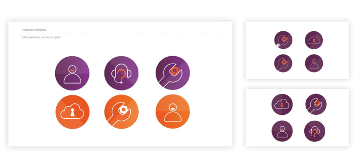
We completed our initial explorations into a new set of pictograms. A number of different styles and colours were explored, including many variations of line and solid illustrations. We will continue to refine the preferred routes in the next few weeks.

Gradient explorations
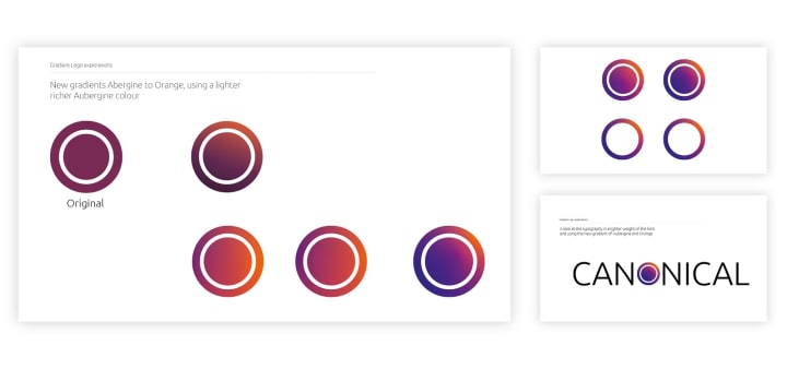
Our colours are an important and integral part of the brand, we are exploring different ways to use them including in gradients. We tried some new combinations and variations and applied them to logos and a couple of product dashboards.

MAAS
The MAAS squad develops the UI for the MAAS project.
CLI commands improvement prototype
This week, maas UX is focused on improving the CLI experience in MAAS. We’ve created a simple prototype in commanderJS, starting with 4 most basic commands as a proof of concept of 4 different outputs – help, list, commission, deploy.
Our goal is to simplify the input structure and provide outputs that are more human-readable. This version still needs a lot of refinement and polishing, but this is where we start.
The first command is our initial help page. By typing $maas or $maas –help, a user should receive an output that helps them get started quickly. The initial help command is broken down into subtopics to provide our users with a better understanding of their action.

We’ve also introduced the concept of the primary object, which in this case is `machines`. When a user performs an action against a primary object, they shouldn’t need to add a MAAS object as the second argument. Therefore, maas list and maas machine list should have the same output
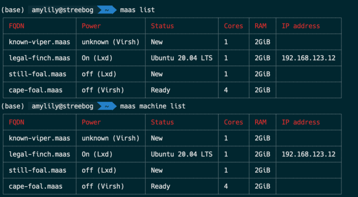
We reduced the number of columns to these 6 columns as default, because we are aware that some users might have a smaller terminal size and we’d rather not break the viewports. A user should also have an option where they can change their output format to JSON or YAML as well
We also want to introduce a loading state to the CLI, for instance, maas commission [MACHINE_NAME] will show a spinner while it is processing and shows a table output with a new status when it is completed.


Finally, for certain commands like deploy, where a user needs to parse a lot of arguments, we will create a more interactive experience in the CLI to help our users parse the right arguments.

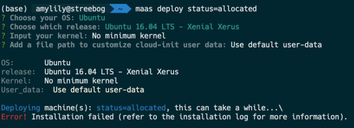
Once there is an error, we will try to show the error from our event log for normal mode and bring out the file system error logs on --verbose or --debug modes.
SR-IOV NUMA
Our NUMA node design is finally completed this week. After 9 design iterations and feedback collections, we’ve come to the conclusion for our designs. There are 2 important views for the NUMA aware VMs – the aggregated view and the NUMA node view.

In the aggregated view, we show a summary of our resources in one place. The resources card is broken down into RAM (with hugepages), CPU cores, virtual functions, and total VMs that are connected to the instance.
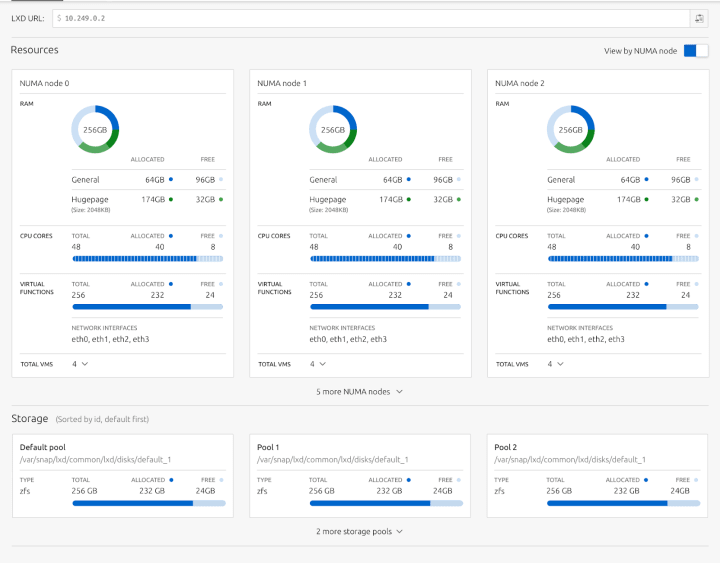
The NUMA node view breaks down the aggregated view by NUMA node. Each NUMA node displays how much a broken-down view of what is allocated and free. Besides, if hugepage memory is set, it can also show how much space in the virtual memory is allocated for it.
JAAS
The JAAS squad develops the UI for the JAAS store and Juju GUI projects.
Cross model relation design for the dashboard
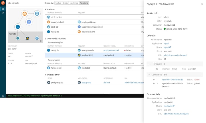
Representing Cross Model Relations (CMR), which allows applications in different models to be related, is an area that our Juju team has always been trying to explore and keep the visual complexity to a minimum.
The last iteration, we did user research and held a workshop session to ideate solutions. This iteration, we have completed the first version of the CMR wireframes: Under a specific ‘Relation’ view, all CMRs with their status, existing connected offers and available offers for consumption will be available via the Juju dashboard. A panel synthesising information from both the Offer and Consumer side will also be available for more details
We will gather some feedback from Juju users in the next iteration and will continue to polish design improvements.

Vanilla
The Vanilla squad designs and maintains the design system and Vanilla framework library. They ensure a consistent style throughout web assets.
This was mostly a maintenance iteration as we had a few people out.
Suru strips
We have used what we call Suru strips on our sites for a while now. So we have promoted them into Vanilla to centralise the maintain the pattern.


Checkbox improvements
We have custom styling for checkboxes but were limited by the order of the markup which was causing issues in some situations. We have developed a custom checkbox pattern which allows us to control the styling. Which falls back to the browser default styling if not used.

Table improvements
Vanilla tables are often used in scenarios where high information density is key. To improve scannability and readability, we’ve made subtle adjustments to make text stand out more against the row borders:
- Lightened borders between rows
- Darkened column headers to make them stand out more on long pages with lots of tables

Investigated increasing the default page width
Most of our websites use a fixed width of 72rem. We did an evaluation of a number of sites at wider widths (up to 90rem) to determine whether this would improve the reading experience.
We found out that, while the wider widths do create opportunities for much more efficient use of screen real estate, significant markup changes would be necessary to take full advantage of the available space. We concluded the effort would currently outweigh the benefits.
Snapcraft and Charm Hub
The Snapcraft team works closely with the Store team to develop and maintain the Snap Store site and the upcoming Charmhub site.
Snap model management
Model management is a part of Snapcraft that is only visible to brand store owners, where they can define some of the basic setup of a device, defined as it’s model. The model contains details such as the architecture and base of the device, as well as all the snaps that consist within it.
The model management views are going to be read-only for the moment, however, they will be extended to be actionable in the future.
Charm Hub developer experience
The UX team continues to improve the way charms could be displayed on the charm page. From the overview to the documentation of the charm itself. More details coming soon.
Charm Hub tutorials
Following the way, we include tutorials across our sites with discourse. We integrated the existing tutorials into Charm Hub. They can be found following the tag `operator framework` on the Juju discourse at the moment.


